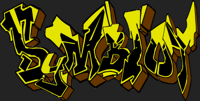
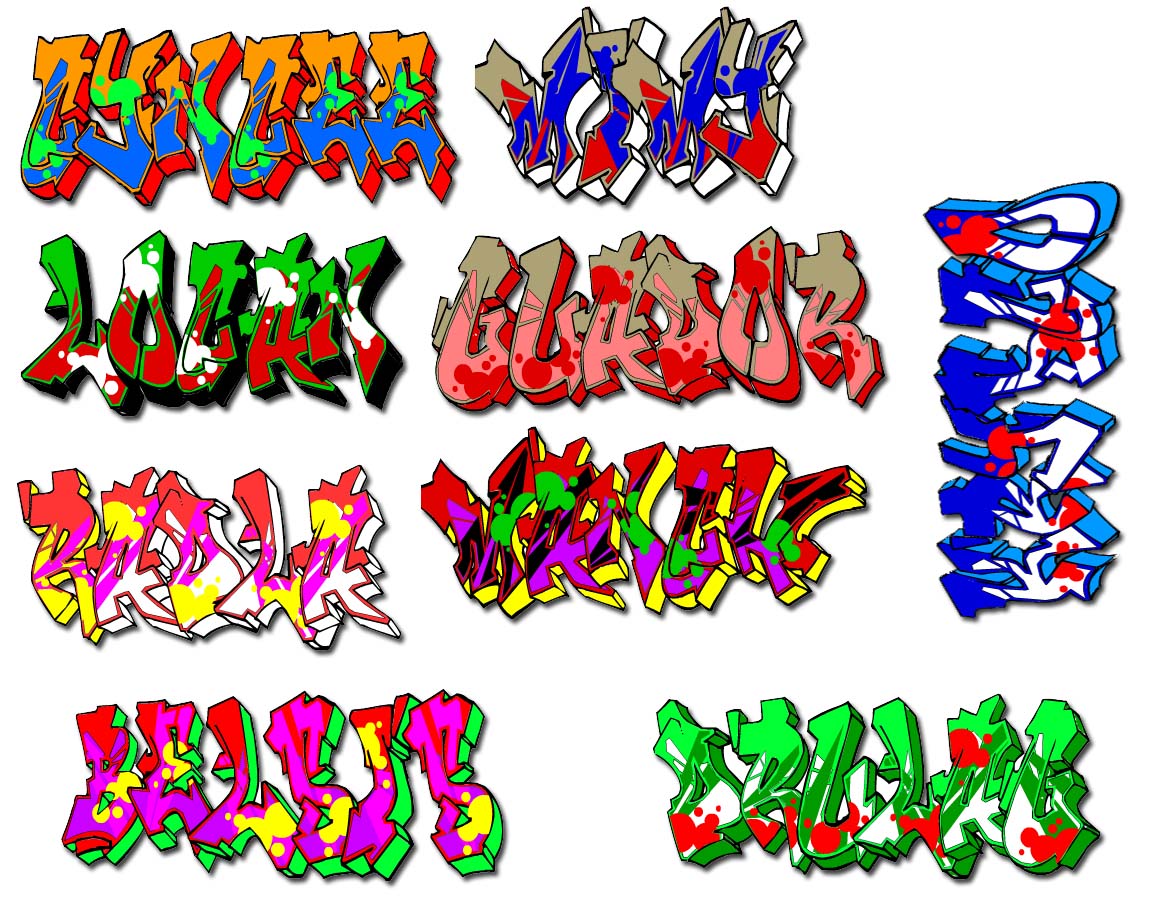
Frequently when I am building a website after the customer has looked at a few revisions, the topic of conversation drifts to the fonts that should be used on the website. This is the time that the fun really starts to begin! Usually the customer has been browsing around Word on their machine and playing with a few fonts there. So the question is put, "Can we have ultra curly school boy graffiti font for all of the headings and...".
Stop right there! Go no further. The problem is that whilst this font might look stunning on your website, what will it look like when your customers visit your website? And here is the problem and it is preceded with a technical explanation.
When you open a website the style sheets dictate what fonts, or font families, should be used within the various areas of the webpage that you are opening. But all that this code does is to refer the browser to the list of font that you already have installed on your machine. So if you have installed ultra curly school boy graffiti on your machine then you will be able to see that font when you open the page. But, if this ultra fancy font is not installed on your machine, then the default will be used.
So to be safe, when planning what fonts to use on the various elements of the page it is safest to stick to just those fonts that are installed on the majority of machines and will appear roughly the same. Here we are looking at not only the different versions of Windows machines, but also Macs.
This means that the list of fonts that are compatible with the majority of users is very limited. There are plenty of sites that list most of them and allow you to see what they will appear as, but the choice is very limited.
Which is why we then get to a list of standard fonts that we see in use on sites time and time again. Arial, Times New Roman, Verdana, Garamond and so on.
Sadly, this list does mean that the fonts we get to play with are not that exciting, but if you want to be displaying the page as text, then that is the rule that we have to abide by. But, there are alternatives. For example, if you are designing banners, logos and other elements of the page then these can be created as images on your computer and this gives you the freedom to experience any font that you can find on the internet. The downside - well images are not accessible to search engines and accessible readers, so the content of the page cannot really depend on such techniques.
You could use graphics for headers and supply an alt attribute for search engines and those unable to read the graphics if you are desperate to use a fancy font. But, aside from this cheat, the best fonts to use when you are creating a website are those boring and frequently used fonts listed above.


No comments:
Post a Comment